-
![]()
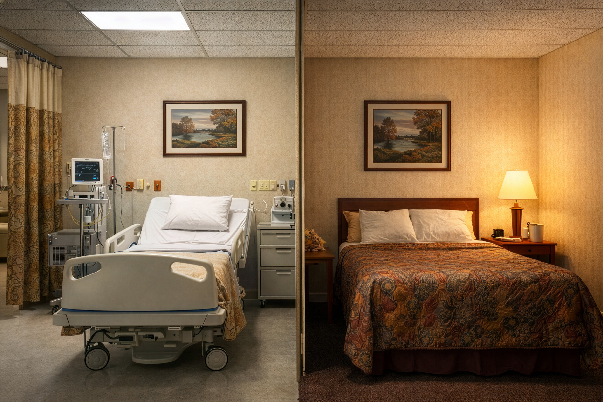
𝗧𝗵𝗲𝘀𝗲 𝗮𝗿𝗲 𝘁𝗵𝗲 𝘀𝗮𝗺𝗲 𝘀𝗽𝗮𝗰𝗲. 𝗪𝗵𝘆?
The other day I found myself in the triage wing of a hospital. Thank G-d it was for a good reason.
But I noticed something. The space felt an awful lot like a cheap hotel.
And it made me wonder what a hospital and a cheap hotel have in common.
They are both masks.
Sitting in triage, you can tell the room is designed more for medical equipment than for people. It is a health factory. Because the organisms being treated happen to be human and have emotions, a thin aesthetic layer gets applied. Stock photos of barns in frames, drab patterned curtains, plastic baseboards.
The cheap hotel operates the same way. At its core it is a business. People get tired, they need a place to sleep, and they will pay for that. Because we are human, the space is dressed up just enough to keep it from feeling completely alienating.
In both cases you are in a hollow space. One that puts up a facade to trick you, or at least your nervous system, into thinking it is something it is not.
I am reminded of a teaching from the Talmud. Rabbi Yosei said:
“In all my days I did not call my wife ‘my wife,’ nor my ox ‘my ox.’ Rather, I called my wife ‘my home,’ because she is the essence of my home, and I called my ox ‘my field,’ because it is the ox that brings the field to life.”
In other words, Rabbi Yosei did not define things by their function, but by their essence.
An ox is not simply a device to pull a plow. It is sustenance.
A hospital is not a healing factory. It is a place to feel renewed.
A hotel is not a sleep chamber. It is a home while you are away.
If we designed spaces based on what they truly are, rather than the mechanical functions by which they operate, architecture would flip completely. Hospitals would be spaces designed for healing, with equipment woven discreetly into them. Motels would be places rich with human touches and details that just happen to include a bed and a door you can lock.
When we start with function and then superimpose experience, we get what we usually see. Hospitals and cheap hotels.
As architects, we have another option.
Start with the experience you want to create. Then design the functions that make it possible. -
![]()
𝗗𝗲𝗳𝗲𝗻𝘀𝗲 𝘃𝘀. 𝗢𝗳𝗳𝗲𝗻𝘀𝗲
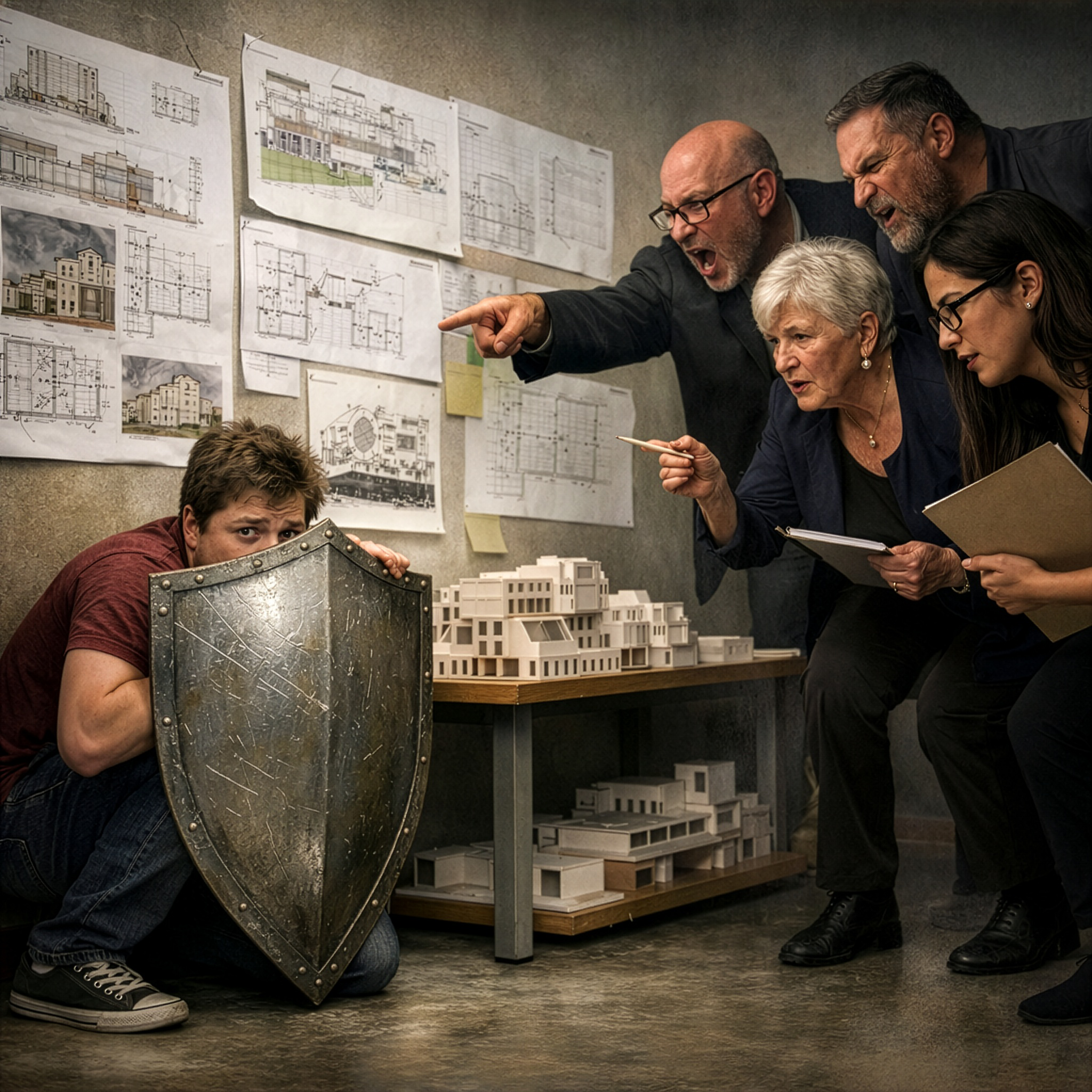
Architects are taught to design aspirationally, but trained to design defensively.
It’s not exactly anyone’s fault. The structure of architectural education revolves around the crit – a system that, frankly, I think we should abolish. In practice, the crit often trains students to censor their creativity before it even sees the light of day, out of fear of public criticism. Projects begin with bold ideas, but once students imagine all the unresolved pieces a critic might point out, they start chipping away. What remains is something safe, something that resembles what’s been done before. Ironically, critics often fault the work for that very reason.
The same pattern shows up in professional practice. Architects repeat the same development schemes, the same layouts, the same façade strategies, assuming developers or clients will never accept anything else. We complain about value engineering, but often the value engineering happens long before anyone outside the team raises an eyebrow.
In my experience, the norm can be challenged. The catch is that you have to be good.
If you’re going to push boundaries, you have to demonstrate that what you’re proposing is actually superior to the default. And usually that superiority has to translate into numbers as well. But that’s precisely why the best clients hire architects - not to take orders from them, but to guide them.
As Frank Gehry once said: “I don’t know why people hire architects and then tell them what to do.”
To me, the issue goes beyond business. If you spend your career playing architectural defense, you might be successful. But you’ll likely contribute little to the advancement of architecture and the places where people live and grow.
Trust yourself and go on offense.
Just remember - you have to be good. -
![]()
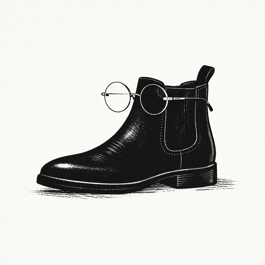
𝗖𝗵𝗲𝗹𝘀𝗲𝗮 𝗕𝗼𝗼𝘁𝘀 & 𝗥𝗶𝗺𝗹𝗲𝘀𝘀 𝗚𝗹𝗮𝘀𝘀𝗲𝘀
These are two items I bought recently. They also happen to embody my entire design philosophy.
Great design, whether in architecture, products, or any creative field, rests on two fundamental principles:
𝗥𝗲𝗱𝘂𝗰𝘁𝗶𝗼𝗻: distilling something to its most elemental form, using the fewest parts necessary.
𝗥𝗲𝗳𝗿𝗮𝗺𝗶𝗻𝗴: discovering latent potential in materials or forms that others overlook.
Consider rimless glasses. Glass lenses don’t actually need a frame. The same material that corrects your vision has the structural integrity to support itself. You can drill directly through it and attach hardware. The material does the work.
My particular frames take this further. Instead of traditional nose pads, a single piece of metal is twisted precisely to connect the lenses and distribute their weight. Since wearing them, I’ve started noticing nose pads everywhere. Small, clinical plastic additions we’ve all learned to ignore. Here, reduction removes unnecessary parts, and reframing asks one element to perform multiple roles.
The same logic applies to Chelsea boots. While they feel modern, the design dates back to the Victorian era and the invention of vulcanized rubber. Elastic is reframed to replace laces, buckles, and tongues. The shoe is reduced to two elements: leather for protection and elastic for flexibility. No hardware to break. Simplicity is luxury.
Architecturally, these ideas are embodied in the humble barn. Its size, structure, roof profile, and door design emerge directly from use and economy. Even the iconic red paint is an act of reframing. Iron oxide was added to oil for protection and longevity.
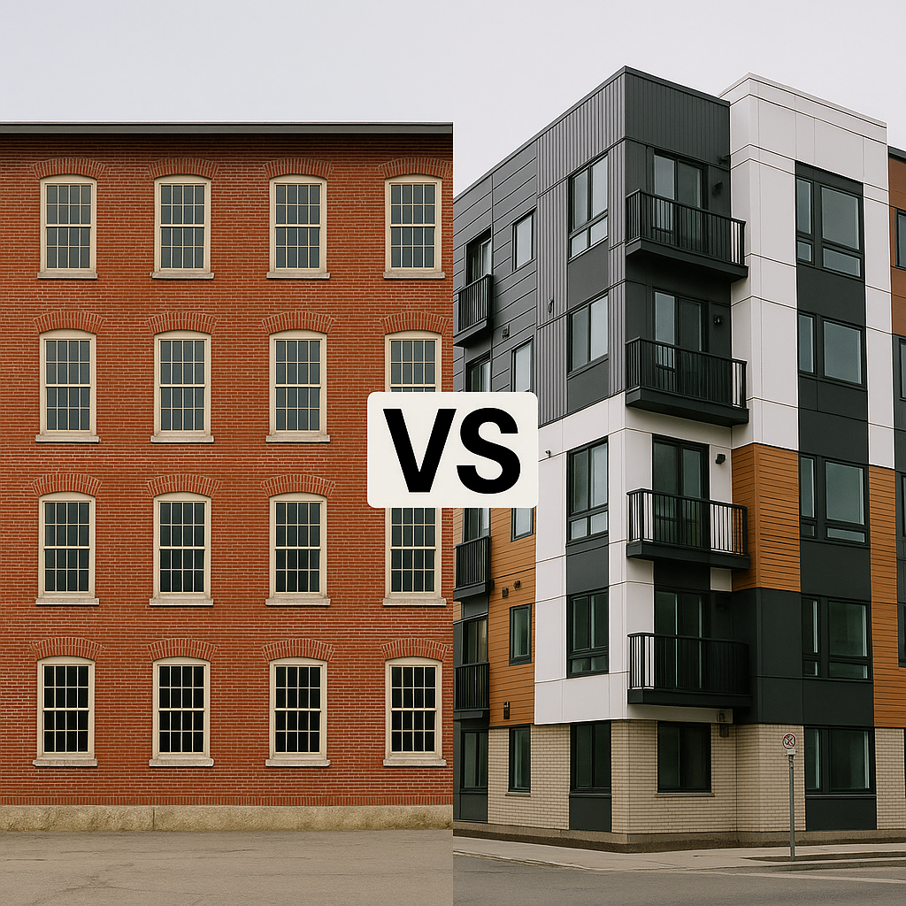
There’s something unmistakable about stepping into a barn or an old mill building. You feel it immediately. An honesty born from reduction, from being exactly what it needs to be and nothing more.
But reduction and reframing don’t mean minimalism. This isn’t an argument that we should only build barns, wear rimless glasses, and ban shoe laces. Gehry’s Bilbao, Saarinen’s TWA Terminal, even the Art Nouveau movement all achieved reduction. What they needed to be reduced to, given their political, economic, or social aims, was something bold, expressive, and lavish. Architecture always makes a statement. The challenge is knowing what the building should say and stopping once it’s said clearly.
Ultimately, a designer’s role is to recognize potential and give it just enough form to stand on its own. When that happens, whether it’s a pair of glasses, a boot, or a building, the design feels inevitable, as if it couldn’t be any other way. -
![]()
𝗜 𝗹𝗼𝘃𝗲𝗱 𝗺𝘆 𝗽𝗿𝗼𝗳𝗲𝘀𝘀𝗼𝗿’𝘀 𝗮𝗻𝘀𝘄𝗲𝗿 𝘁𝗼 𝘁𝗵𝗶𝘀 𝗾𝘂𝗲𝘀𝘁𝗶𝗼𝗻.
During my junior year of college, I went abroad to Florence to join the Syracuse architecture program there for a semester.
As much as I loved my liberal arts studies at Oberlin, I needed a break from talking about talking about architecture and wanted to actually get my hands dirty and make some stuff.
I had a wonderful professor and architect, Gianandrea Barreca of Barreca & La Varra. He imparted a lot of wisdom, but what stuck with me most was his simple, innocent answer to a question I asked him.
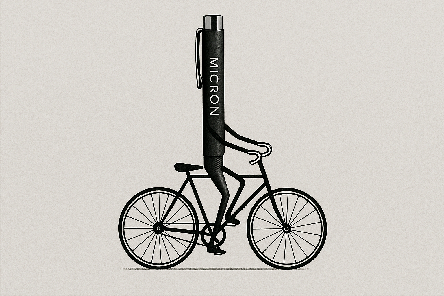
Gianandrea traveled with a pencil case overflowing with writing accoutrements—sharpies, fountain pens, pencils, colored pencils, highlighters, markers. I asked him why he carried so many instruments. Surely one was his favorite? How did he choose which one to use?
He looked at me, smiling and slightly puzzled.
“𝘚𝘰𝘮𝘦 𝘥𝘢𝘺𝘴 𝘐 𝘧𝘦𝘦𝘭 𝘭𝘪𝘬𝘦 𝘮𝘢𝘬𝘪𝘯𝘨 𝘣𝘰𝘭𝘥 𝘧𝘢𝘵 𝘭𝘪𝘯𝘦𝘴, 𝘢𝘯𝘥 𝘐 𝘳𝘦𝘢𝘤𝘩 𝘧𝘰𝘳 𝘵𝘩𝘦 𝘚𝘩𝘢𝘳𝘱𝘪𝘦. 𝘚𝘰𝘮𝘦 𝘥𝘢𝘺𝘴 𝘐 𝘸𝘢𝘯𝘵 𝘵𝘰 𝘶𝘴𝘦 𝘤𝘰𝘭𝘰𝘳, 𝘴𝘰 𝘐 𝘩𝘢𝘷𝘦 𝘤𝘰𝘭𝘰𝘳𝘦𝘥 𝘱𝘦𝘯𝘤𝘪𝘭𝘴. 𝘚𝘰𝘮𝘦𝘵𝘪𝘮𝘦𝘴 𝘐 𝘸𝘢𝘯𝘵 𝘵𝘰 𝘴𝘤𝘳𝘪𝘣𝘣𝘭𝘦 𝘢𝘯𝘥 𝘨𝘰 𝘰𝘷𝘦𝘳 𝘢 𝘥𝘳𝘢𝘸𝘪𝘯𝘨 𝘮𝘢𝘯𝘺 𝘵𝘪𝘮𝘦𝘴, 𝘴𝘰 𝘐 𝘩𝘢𝘷𝘦 𝘢 𝘱𝘦𝘯𝘤𝘪𝘭…”
As architects, we so often want to optimize and perfect everything—our workflows, our drawing styles, our design studies, our tools, our work. Whenever I feel that tightening inner voice telling me to tweak something just a bit more, to find the perfect proportions, the perfect material, the perfect pen, I think about this moment and Gianandrea’s answer.
Let things flow. Trust your intuition. Let yourself feel one way today and a different way tomorrow. There are no right answers. Every tool and mode of expression has something to offer. Be open, and have fun. -
![]()
𝗪𝗲’𝗿𝗲 𝗮𝗹𝗹 𝗰𝗵𝗮𝘀𝗶𝗻𝗴 𝘁𝗵𝗲 𝘀𝗮𝗺𝗲 𝘁𝗵𝗶𝗻𝗴.
I’ll tell you what it is:
𝗔 𝘀𝗮𝗻𝗰𝘁𝘂𝗮𝗿𝘆 𝗼𝗳 𝗳𝗿𝗶𝗰𝘁𝗶𝗼𝗻𝗹𝗲𝘀𝘀 𝗲𝘅𝗶𝘀𝘁𝗲𝗻𝗰𝗲.
We want everything seamless and effortless.
A beautiful home. No financial stress. Secure relationships. Perfect health, constant energy. Nothing breaking, getting lost, or delayed. Everyone clearing the way so we can finally rest in uncomplicated bliss.
At least, that’s what we think we want.
Two problems with that:
1. It’s an unobtainable fantasy.
2. It’s not what we really want.
Because this vision — though deeply familiar — isn’t life.
It’s the 𝘢𝘣𝘴𝘦𝘯𝘤𝘦 of it.
What we actually crave is 𝘱𝘶𝘳𝘱𝘰𝘴𝘦. Growth. The feeling of being needed — of contributing. These pursuits are messy, unpredictable, full of friction —
and they’re the source of everything meaningful.
This concept applies to all areas of life — but since this is where we talk about architecture and design, let’s start there.
Taking the subway, I’m struck by the ads above the windows — five words or less, sans-serif on flat color, maybe an emoji.
Advertising used to be a craft — illustrated by hand, conceived by people who appreciated their audience’s intelligence. They still sold things — but they also spoke to something human.
Now everything’s reduced to the primal hook: a pop of color, a dopamine hit. We’ve become allergic to friction — to effort, to depth, to pause.
As designers and architects, we face a choice every day:
𝗗𝗼 𝘄𝗲 𝗰𝗮𝘁𝗲𝗿 𝘁𝗼 𝘁𝗵𝗲 𝗳𝗿𝗶𝗰𝘁𝗶𝗼𝗻-𝗮𝘃𝗼𝗶𝗱𝗮𝗻𝘁 𝘀𝗲𝗹𝗳 — 𝗼𝗿 𝘁𝗵𝗲 𝗽𝘂𝗿𝗽𝗼𝘀𝗲-𝘀𝗲𝗲𝗸𝗶𝗻𝗴 𝗼𝗻𝗲?
Many design sanctuaries of frictionless existence. They photograph beautifully. They win awards. But they stop short of what architecture can do.
This attitude doesn’t produce Frank Gehrys, Zaha Hadids, Gaudís, or Eero Saarinens. These are architects who wrestled. They didn’t meet people where they were; they showed them where they could go. Their process was messy, expensive, full of friction — like life itself. And through that friction, they built more than buildings — 𝘵𝘩𝘦𝘺 𝘣𝘶𝘪𝘭𝘵 𝘮𝘦𝘢𝘯𝘪𝘯𝘨.
𝗪𝗲’𝘃𝗲 𝗽𝗲𝗿𝗳𝗲𝗰𝘁𝗲𝗱 𝘁𝗵𝗲 𝗮𝗿𝘁 𝗼𝗳 𝗲𝗮𝘀𝗲.
𝗠𝗮𝘆𝗯𝗲 𝗶𝘁’𝘀 𝘁𝗶𝗺𝗲 𝘄𝗲 𝗿𝗲𝗱𝗶𝘀𝗰𝗼𝘃𝗲𝗿 𝘁𝗵𝗲 𝗮𝗿𝘁 𝗼𝗳 𝗲𝗳𝗳𝗼𝗿𝘁. -
![]()
𝗦𝘁𝗼𝗽 𝗖𝗮𝗹𝗹𝗶𝗻𝗴 𝗔𝗜 𝗖𝗿𝗲𝗮𝘁𝗶𝘃𝗲.
Not long ago, I sat through a presentation on AI in architecture. The presenter fed a few AI tools the exact copy of a real project brief, asked them to restate the goals, and then had them generate hyper-realistic renderings.
The room went silent. The unspoken energy: “𝘚𝘰… 𝘵𝘩𝘪𝘴 𝘪𝘴 𝘵𝘩𝘦 𝘦𝘯𝘥 𝘰𝘧 𝘵𝘩𝘦 𝘳𝘰𝘢𝘥 𝘧𝘰𝘳 𝘶𝘴.”
Cue the optimist: “𝘋𝘰𝘯’𝘵 𝘸𝘰𝘳𝘳𝘺, 𝘈𝘐 𝘵𝘰𝘰𝘭𝘴 𝘢𝘳𝘦 𝘵𝘰𝘰 𝘶𝘯𝘱𝘳𝘦𝘥𝘪𝘤𝘵𝘢𝘣𝘭𝘦 𝘵𝘰 𝘳𝘦𝘱𝘭𝘢𝘤𝘦 𝘶𝘴. 𝘛𝘩𝘦𝘺’𝘳𝘦 𝘨𝘳𝘦𝘢𝘵 𝘧𝘰𝘳 𝘪𝘥𝘦𝘢 𝘨𝘦𝘯𝘦𝘳𝘢𝘵𝘪𝘰𝘯, 𝘣𝘶𝘵 𝘵𝘩𝘦𝘺 𝘭𝘢𝘤𝘬 𝘵𝘩𝘦 𝘱𝘳𝘦𝘤𝘪𝘴𝘪𝘰𝘯 𝘢𝘯𝘥 𝘤𝘰𝘯𝘵𝘳𝘰𝘭 𝘧𝘰𝘳 𝘳𝘦𝘢𝘭 𝘱𝘳𝘰𝘧𝘦𝘴𝘴𝘪𝘰𝘯𝘢𝘭 𝘸𝘰𝘳𝘬.”
Two problems with that argument:
1. 𝗡𝗮𝗻𝗼 𝗯𝗮𝗻𝗮𝗻𝗮. These tools are already pretty darn precise.
2. It points to a fundamental misunderstanding of the nature of human creativity.
AI produces results that look sophisticated, but under the hood it’s brute-force pattern recognition: a fill-in-the-blank machine on steroids. Incredibly powerful—but it’s not creativity.
By contrast, human creativity doesn’t require billions of inputs. Small children can be wildly original with only a handful of life experiences. That’s because creativity isn’t probabilistic remixing. It’s tuning the antenna of the mind to tap into something higher, something truly original—and bringing it into the world.
AI is an amazing tool to augment our productivity. But it’s still a cheap replica of the human mind. Use it. Embrace it. Just don’t mistake it for ingenuity.
That, no nano banana, pixel cucumber, or robo kiwi can take away from you.
-
![]()
𝗜𝘁𝗲𝗿𝗮𝘁𝗶𝗼𝗻 𝘃𝘀. 𝗜𝗱𝗲𝗮𝘁𝗶𝗼𝗻
Iteration is laziness.
There, I said it.
In architecture firms, it’s all too common to hear: “𝘊𝘢𝘯 𝘺𝘰𝘶 𝘱𝘶𝘵 𝘵𝘰𝘨𝘦𝘵𝘩𝘦𝘳 𝘢 𝘧𝘦𝘸 𝘰𝘱𝘵𝘪𝘰𝘯𝘴?”
It might look like design, but to me, it’s just hedging.
It’s an inefficient use of time and a sign of an immature process. Chefs don’t invent new dishes by tossing the same ingredients into different pots and hoping one tastes right. They start with a clear vision and build with intention.
I’m not saying iteration can’t achieve successful results—in fact, many prominent architects have built their careers on this approach. But I can’t help but reject it as a design philosophy.
By all means, explore—but endless iteration is not a substitute for real ideation—intentional, well-considered moves grounded in expertise. Too often in client meetings we show three schemes and explain why two of them don’t work. That doesn’t inspire confidence. It doesn’t speak to leadership. It dilutes the value of design.
Much stronger is to say:
“𝗛𝗲𝗿𝗲’𝘀 𝘄𝗵𝗮𝘁 𝘄𝗲’𝗿𝗲 𝗽𝗿𝗼𝗽𝗼𝘀𝗶𝗻𝗴—𝗮𝗻𝗱 𝗵𝗲𝗿𝗲’𝘀 𝘄𝗵𝘆.”
Design isn’t about cataloguing what 𝘤𝘰𝘶𝘭𝘥 work.
It’s about consciously navigating to what 𝘥𝘰𝘦𝘴.
Let’s lead with ideas—not options.
-
![]()
𝗞𝗲𝗲𝗽 𝗬𝗼𝘂𝗿 𝗙𝗮𝗻𝗰𝘆 𝗣𝗲𝗻𝘀—𝗕𝘂𝘁 𝗟𝗲𝘁 𝗚𝗼 𝗮 𝗟𝗶𝘁𝘁𝗹𝗲
Spend enough time around architects and you start to notice a pattern.
The love of fancy pens. The muted but meticulously curated wardrobes. The willingness to spend countless underpaid hours moving pixels on a screen for work that might never see the light of day. It’s an odd mix of traits—quirky, intense, obsessive.
𝗕𝘂𝘁 𝗜 𝗵𝗮𝘃𝗲 𝗮 𝘁𝗵𝗲𝗼𝗿𝘆 𝗮𝗯𝗼𝘂𝘁 𝘄𝗵𝗮𝘁 𝘁𝗶𝗲𝘀 𝘁𝗵𝗲𝗺 𝗮𝗹𝗹 𝘁𝗼𝗴𝗲𝘁𝗵𝗲𝗿:
Architects are on a quest for control.
Not control in the manipulative sense (hopefully), but in the more subtle sense—the power and freedom that come from being in control. From shaping something with intentionality. Like an orchestra conductor, architects seek to conduct physical space into harmony and beauty.
Most architects I’ve met believe deeply in the power of design to transform the world. They’re not satisfied with “good enough.” They believe things can be better—and that they 𝘴𝘩𝘰𝘶𝘭𝘥 be.
A building should be better.
A city should function better.
𝘐 should be better.
That language of “should” runs through the architect’s inner and outer world. And the tool we reach for, again and again, is control.
This internal drive makes architects highly motivated, deeply self-aware, and often incredibly self-critical. There’s a reason the stereotype exists of the cold, cerebral architect: the mind is easier to control than emotion. Warmth is volatile; the intellect is safer. Black clothing and minimalism are not just aesthetic choices—they're strategies for clarity and simplicity.
But the same impulse for order often spills into every corner of life. An architect’s obsession with the details of a building is mirrored in their curated playlists, their favorite mechanical pencils, even their perfectly labeled packing cubes.
This relentless pursuit of “should” is a double-edged sword.
It’s our superpower—but also our stumbling block.
Because control, unchecked, becomes a cage. The healthiest, most successful architects I know are the ones who’ve found a balance. They still care deeply. They still obsess over the details. But they’ve also learned to let go—of perfection, of rigidity, of fear. They’ve embraced warmth, emotion, vulnerability. They’ve made space for wisdom from others, for collaboration, for surprise.
And in doing so, they don’t just become better architects—they become fuller versions of themselves.
So yes—keep your fancy pens. Wear all the black you want.
But don’t forget to be human.
The world needs your eye for beauty and your hunger for better—
but it needs your heart even more. -
![]()
𝗕𝗲𝘆𝗼𝗻𝗱 𝗟𝗼𝗴𝗶𝗰: 𝗔𝗿𝗰𝗵𝗶𝘁𝗲𝗰𝘁𝘂𝗿𝗲 𝗮𝗻𝗱 𝘁𝗵𝗲 𝗦𝘂𝗽𝗲𝗿-𝗥𝗮𝘁𝗶𝗼𝗻𝗮𝗹
In most models of education, we’re taught to think in binaries: rational or irrational, logical or illogical. If something makes sense, it’s good; if it doesn’t, it’s dismissed. These two realms—logic and its absence—are where we’re told all thought must reside.
But Hasidic philosophy offers a third category: 𝘵𝘩𝘦 𝘴𝘶𝘱𝘦𝘳-𝘳𝘢𝘵𝘪𝘰𝘯𝘢𝘭.
This isn’t the realm of wishful thinking. It’s something higher—𝘣𝘦𝘺𝘰𝘯𝘥 reason, not beneath it. And crucially, it isn’t a rejection of logic, but a completion of it.
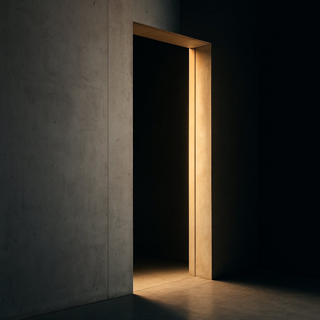
Hasidic thought urges us to use the mind rigorously—to understand through the full power of reason. But reason has limits. The mind eventually encounters a boundary—a door it cannot pass through. And at that threshold, a different kind of knowing begins: the super-rational.
From there, the work continues not through more analysis, but through intuition, sensitivity, and attunement—qualities that emerge with discipline and practice.
This idea has deep implications for architecture—and for all creative work.
As architects, we are charged with designing rationally. A building must make sense. It must function, cohere, and express clear intent. Everything—site plan, structure, materials, even a doorknob—should connect back to a central idea.
But great architecture doesn’t stop there.
Eventually, the very logic we’ve built begins to limit the design. The rules we’ve created start to constrain rather than serve. That’s when we know we’ve reached the door. And now we face a different task: to step beyond reason and into the realm of the super-rational.
This is where architecture begins to ask different kinds of questions:
𝘞𝘩𝘢𝘵 𝘥𝘰𝘦𝘴 𝘵𝘩𝘦 𝘣𝘶𝘪𝘭𝘥𝘪𝘯𝘨 𝘸𝘢𝘯𝘵 𝘵𝘰 𝘣𝘦?
𝘞𝘩𝘢𝘵 𝘥𝘰𝘦𝘴 𝘪𝘵 𝘧𝘦𝘦𝘭 𝘭𝘪𝘬𝘦 𝘪𝘵 𝘯𝘦𝘦𝘥𝘴?
These aren’t analytical questions. They’re perceptive ones. They belong to a different mode of working—one that relies less on problem-solving and more on presence, listening, and instinct. It's a shift from control to attunement.
Design becomes less about applying rules and more about letting go of them. Logic becomes a foundation we step off from. And from that ground, something deeper can emerge.
The most compelling buildings often come from this space. They may bend convention, ignore efficiency, or defy explanation—and yet they resonate. People are less inclined to question the cost or excess, because the result feels undeniably 𝘳𝘪𝘨𝘩𝘵. It carries a kind of truth that doesn’t need to be justified.
So while architecture must begin with reason, it can’t end there. Logic gives us clarity and form, but eventually it begins to constrain. The real work is knowing when to let go—when to design not just with the mind, but with instinct, presence, and trust.
That’s when architecture becomes more than functional.
That’s when it gains meaning. -
![]()
𝗪𝗵𝘆 𝗜 𝗦𝘁𝗶𝗹𝗹 𝗕𝗲𝗹𝗶𝗲𝘃𝗲 𝗶𝗻 𝗣𝗵𝘆𝘀𝗶𝗰𝗮𝗹 𝗠𝗼𝗱𝗲𝗹𝘀
A little while back, someone asked in our office:
𝗪𝗵𝗶𝗰𝗵 𝗶𝘀 𝗯𝗲𝘁𝘁𝗲𝗿—𝗮 𝗿𝗲𝗮𝗹𝗶𝘀𝘁𝗶𝗰 𝗱𝗶𝗴𝗶𝘁𝗮𝗹 𝗿𝗲𝗻𝗱𝗲𝗿𝗶𝗻𝗴 𝗼𝗿 𝗮 𝗽𝗵𝘆𝘀𝗶𝗰𝗮𝗹 𝗺𝗼𝗱𝗲𝗹?
My answer? 𝗣𝗵𝘆𝘀𝗶𝗰𝗮𝗹 𝗺𝗼𝗱𝗲𝗹.
But not for the reasons you might expect.
It’s not that physical models represent a design better. It’s that the 𝘱𝘳𝘰𝘤𝘦𝘴𝘴 𝘰𝘧 𝘮𝘢𝘬𝘪𝘯𝘨 𝘵𝘩𝘦𝘮 shapes the design itself.
In my experience, digital tools—especially Revit (but also Rhino, Grasshopper, CAD, etc.)—suffer from a core flaw:
𝗛𝗮𝗿𝗱 𝘁𝗵𝗶𝗻𝗴𝘀 𝗮𝗿𝗲 𝘁𝗼𝗼 𝗲𝗮𝘀𝘆, 𝗮𝗻𝗱 𝗲𝗮𝘀𝘆 𝘁𝗵𝗶𝗻𝗴𝘀 𝗮𝗿𝗲 𝘁𝗼𝗼 𝗵𝗮𝗿𝗱.
I can generate a decent-looking building in Revit in minutes—set levels, draw walls, array windows, apply materials, import a site—done.
But try modeling a custom stair, modifying a populated model, or working non-orthogonally, and suddenly the simplest move becomes hours of tedious work. The result?
“𝗚𝘂𝗲𝘀𝘀 𝗮𝗻𝗱 𝗰𝗵𝗲𝗰𝗸” 𝗱𝗲𝘀𝗶𝗴𝗻.
We orbit a nice-looking Enscape model, subconsciously hesitant to challenge decisions—not because we believe in them, but because changing them is work. And hey, 𝘪𝘵 𝘢𝘭𝘳𝘦𝘢𝘥𝘺 𝘭𝘰𝘰𝘬𝘴 𝘨𝘳𝘦𝘢𝘵, 𝘳𝘪𝘨𝘩𝘵?
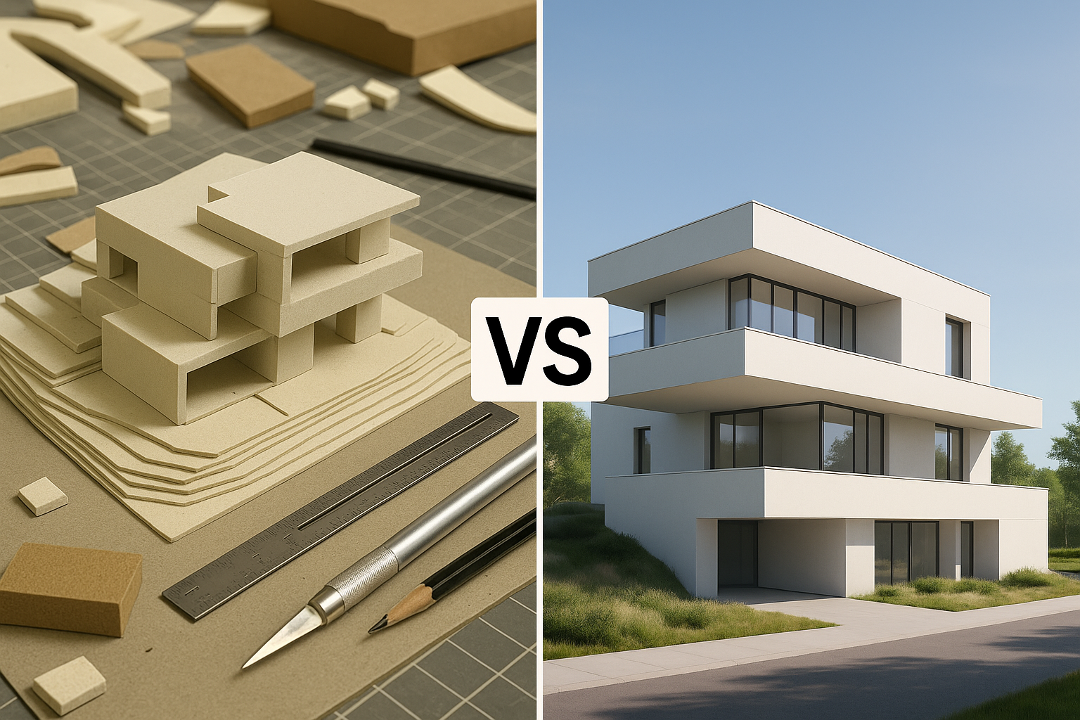
Physical models flip this logic. Foam, chipboard, and wood are forgiving and fast. You can sketch in space, test bold moves, remix and rethink—freely.
But when it’s time to make a finished model? That’s a whole different story. Cutting each piece by hand or laser, assembling, gluing, sanding, landscaping—it’s slow and meticulous. And that labor matters.
It forces you to 𝗰𝗼𝗺𝗺𝗶𝘁 to your decisions. Every move builds on the last. You don’t “guess and check” your way through a physical model. You build it once. And when you present it, you’re saying: 𝘛𝘩𝘪𝘴 𝘪𝘴 𝘵𝘩𝘦 𝘣𝘦𝘴𝘵, 𝘮𝘰𝘴𝘵 𝘪𝘯𝘵𝘦𝘯𝘵𝘪𝘰𝘯𝘢𝘭 𝘥𝘦𝘴𝘪𝘨𝘯 𝘐 𝘤𝘰𝘶𝘭𝘥 𝘮𝘢𝘬𝘦.
𝗘𝘅𝗽𝗹𝗼𝗿𝗮𝘁𝗶𝗼𝗻 𝘀𝗵𝗼𝘂𝗹𝗱 𝗯𝗲 𝗮𝘀 𝗳𝗿𝗶𝗰𝘁𝗶𝗼𝗻𝗹𝗲𝘀𝘀 𝗮𝘀 𝗽𝗼𝘀𝘀𝗶𝗯𝗹𝗲—
𝗯𝘂𝘁 𝗺𝗮𝗸𝗶𝗻𝗴 𝗮 𝗴𝗼𝗼𝗱 𝗳𝗶𝗻𝗶𝘀𝗵𝗲𝗱 𝗽𝗿𝗼𝗱𝘂𝗰𝘁 𝗿𝗲𝗾𝘂𝗶𝗿𝗲𝘀 𝗮 𝗱𝗼𝘀𝗲 𝗼𝗳 𝗳𝗿𝗶𝗰𝘁𝗶𝗼𝗻.
I’m reminded of something a favorite professor once told me in grad school. I was working on a boathouse and mentioned I’d do a quick rendering. He stopped me:
“𝘋𝘰𝘯’𝘵 𝘴𝘩𝘰𝘸 𝘪𝘵 𝘵𝘰 𝘺𝘰𝘶𝘳𝘴𝘦𝘭𝘧. 𝘐𝘧 𝘺𝘰𝘶 𝘴𝘩𝘰𝘸 𝘪𝘵 𝘵𝘰 𝘺𝘰𝘶𝘳𝘴𝘦𝘭𝘧, 𝘺𝘰𝘶’𝘭𝘭 𝘳𝘶𝘪𝘯 𝘪𝘵.”
His point was: stay in plan and section. Let logic guide form. Don’t let visuals drive decisions prematurely. He rarely let us view our projects in 3D—and the work was better for it. Stronger. Clearer. More intentional.
That lesson has stayed with me. Especially now, designing buildings that shape real places and impact real lives.
In a world of instant visuals, there’s still something powerful—and grounding—about the deliberate act of making. -
![]()
𝗪𝗵𝘆 𝗕𝗷𝗮𝗿𝗸𝗲 𝗜𝗻𝗴𝗲𝗹𝘀’ 𝗪𝗼𝗿𝗸 𝗥𝗲𝘀𝗼𝗻𝗮𝘁𝗲𝘀 𝗕𝗲𝘆𝗼𝗻𝗱 𝗔𝗿𝗰𝗵𝗶𝘁𝗲𝗰𝘁𝘂𝗿𝗲
There’s a reason why so many people love the work of BIG—and I’m definitely one of them.
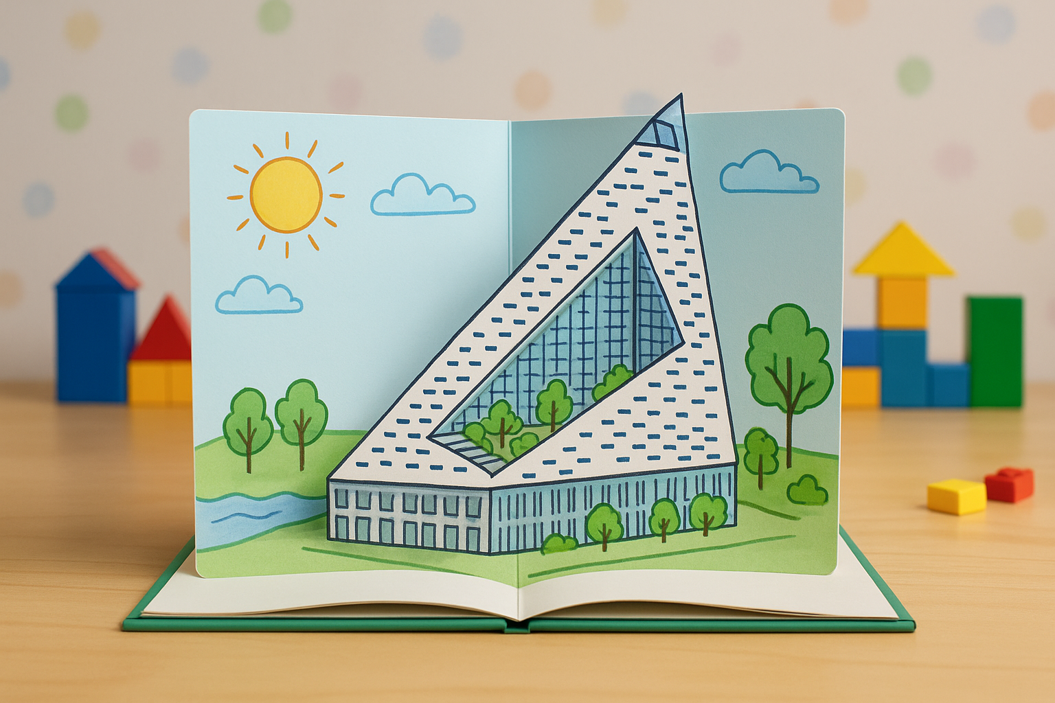
Bjarke Ingels and his team have found a way to bring a rare kind of playfulness into architecture, and scale it up without losing its soul. Their buildings feel imaginative and spontaneous, yet grounded and coherent. They don’t try to be precious or exclusive—they just make good ideas 𝘣𝘪𝘨.
BIG’s projects have a childlike curiosity baked into them. They’re fun, clever, and approachable—never pretentious. That’s a rare achievement. While architects like Foster, Hadid, or Piano deliver technically brilliant and refined work, their buildings tend to sit on a pedestal—complex, admired, but distant.
BIG does something different. Their work is 𝘀𝗶𝗺𝗽𝗹𝗲, 𝗰𝗼𝗵𝗲𝘀𝗶𝘃𝗲, 𝗮𝗻𝗱 𝗳𝘂𝗹𝗹 𝗼𝗳 𝗰𝗵𝗮𝗿𝗮𝗰𝘁𝗲𝗿, offering bold solutions that feel natural, even inevitable. They manage to translate clarity and creativity at scale, all while keeping that spark of joy alive.
𝗧𝗵𝗮𝘁’𝘀 𝘁𝗵𝗲 𝗹𝗲𝘀𝘀𝗼𝗻: design doesn’t have to be complex to be meaningful.
𝗣𝗹𝗮𝘆𝗳𝘂𝗹𝗻𝗲𝘀𝘀, 𝘄𝗵𝗲𝗻 𝗱𝗼𝗻𝗲 𝗿𝗶𝗴𝗵𝘁, 𝗰𝗮𝗻 𝗯𝗲 𝗽𝗼𝘄𝗲𝗿𝗳𝘂𝗹.
BIG proves that architecture can be both visionary 𝘢𝘯𝘥 welcoming—and that’s something worth learning from. -
![]()
𝗢𝗻𝗲 𝗚𝗲𝘀𝘁𝘂𝗿𝗲, 𝗢𝗻𝗲 𝗠𝗮𝘁𝗲𝗿𝗶𝗮𝗹
A new design mantra I’ve been thinking about: one gesture, one material.
There was a time when buildings were conceived as a singular response to a singular purpose. The material wasn’t an aesthetic choice—it 𝘸𝘢𝘴 the building. One material did it all: form, structure, expression.
Today, I’m thinking about this less as a construction approach and more as a visual design philosophy.
Too often, design becomes a collage—steel meets wood meets cladding meets glass. Layer after layer, system after system. We’ve streamlined inefficiency with incredible sophistication, yet the results are often more complex, more costly, and more fragile.
What happens when we strip it back to one clear move and one honest material?
It’s not about minimalism. It’s about clarity. Purpose. Restraint.
𝗢𝗻𝗲 𝗴𝗲𝘀𝘁𝘂𝗿𝗲, 𝗼𝗻𝗲 𝗺𝗮𝘁𝗲𝗿𝗶𝗮𝗹.
Because the strongest designs don’t just look intentional—they 𝘢𝘳𝘦. -
![]()
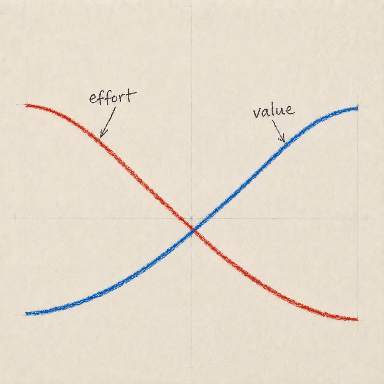
𝗧𝗵𝗲 𝗔𝗿𝗰𝗵𝗶𝘁𝗲𝗰𝘁'𝘀 𝗗𝗶𝗹𝗲𝗺𝗺𝗮: 𝗘𝗳𝗳𝗼𝗿𝘁 𝘃𝘀. 𝗩𝗮𝗹𝘂𝗲
𝗢𝗻𝗲 𝗼𝗳 𝘁𝗵𝗲 𝗵𝗮𝗿𝗱𝗲𝘀𝘁 𝗹𝗲𝘀𝘀𝗼𝗻𝘀 𝗶𝗻 𝗯𝘂𝘀𝗶𝗻𝗲𝘀𝘀 𝗶𝘀 𝘁𝗵𝗮𝘁 𝗲𝗳𝗳𝗼𝗿𝘁 𝗮𝗻𝗱 𝘃𝗮𝗹𝘂𝗲 𝗮𝗿𝗲𝗻'𝘁 𝘁𝗵𝗲 𝘀𝗮𝗺𝗲 𝘁𝗵𝗶𝗻𝗴.
A developer friend of mine recently shared a frustration he's had with architectural fees.
"𝘈𝘳𝘤𝘩𝘪𝘵𝘦𝘤𝘵𝘴 𝘯𝘦𝘦𝘥 𝘵𝘰 𝘱𝘪𝘤𝘬 𝘰𝘯𝘦. 𝘌𝘪𝘵𝘩𝘦𝘳 𝘤𝘩𝘢𝘳𝘨𝘦 𝘣𝘢𝘴𝘦𝘥 𝘰𝘯 𝘵𝘩𝘦 𝘢𝘮𝘰𝘶𝘯𝘵 𝘰𝘧 𝘸𝘰𝘳𝘬 𝘰𝘳 𝘤𝘩𝘢𝘳𝘨𝘦 𝘣𝘢𝘴𝘦𝘥 𝘰𝘯 𝘵𝘩𝘦 𝘢𝘮𝘰𝘶𝘯𝘵 𝘰𝘧 𝘳𝘪𝘴𝘬. 𝘉𝘶𝘵 𝘥𝘰𝘯'𝘵 𝘴𝘸𝘪𝘵𝘤𝘩 𝘩𝘢𝘭𝘧𝘸𝘢𝘺 𝘵𝘩𝘳𝘰𝘶𝘨𝘩 𝘵𝘩𝘦 𝘱𝘳𝘰𝘫𝘦𝘤𝘵."
At first, I agreed with him.
During design, architects justify their fees based on hours, coordination, and creative scope. Then, once construction begins, the conversation shifts to project size, liability, and risk.
It does seem a little disingenuous.
But the more I thought about it, the more I realized it's not really a pricing problem. It's because architecture is, in fact, two completely different services housed within one profession.
During design, the architect is selling creative expertise. The fee follows the amount of thinking, coordination, staffing, iteration, and technical work required.
During construction, the architect isn't primarily selling effort anymore. They're selling judgment, oversight, and accountability over a project worth millions of dollars. The value they're providing has fundamentally changed, so the basis for pricing changes too.
The challenge is that clients don't pay for effort. They pay for value. In most businesses, those two things rise together. In architecture, they don't.
𝗧𝗵𝗲 𝗮𝗿𝗰𝗵𝗶𝘁𝗲𝗰𝘁'𝘀 𝗲𝗳𝗳𝗼𝗿𝘁 𝗮𝗻𝗱 𝘁𝗵𝗲 𝘃𝗮𝗹𝘂𝗲 𝗿𝗲𝗮𝗹𝗶𝘇𝗲𝗱 𝗯𝘆 𝘁𝗵𝗲 𝗰𝗹𝗶𝗲𝗻𝘁 𝗽𝗲𝗮𝗸 𝗮𝘁 𝗱𝗶𝗳𝗳𝗲𝗿𝗲𝗻𝘁 𝘀𝘁𝗮𝗴𝗲𝘀 𝗼𝗳 𝘁𝗵𝗲 𝗽𝗿𝗼𝗷𝗲𝗰𝘁.
The design phase is the most labor-intensive, yet it's also the phase where the client has the least tangible value to show for it. They don't yet have a building - they just have drawings.
By contrast, Construction Administration may involve fewer drawings, but every decision carries far greater financial consequence because the building is finally becoming real.
Maybe that's why architectural fee structures have always felt a little awkward. It's difficult to ask for a significant design fee when the client is still waiting to realize the value, and it's difficult to ask for a significant CA fee when, on the surface, it appears to involve less work.
So while it may frustrate clients, I think it makes perfect sense that the pricing model changes. They're buying two completely different things.
As architects, it's our job to guide them through that transition fairly and transparently, so it never feels like the rules suddenly changed. -
![]()
𝗧𝗵𝗲 𝗣𝗿𝗼𝗯𝗹𝗲𝗺 𝗪𝗶𝘁𝗵 𝗔𝗿𝗰𝗵𝗶𝘁𝗲𝗰𝘁𝘂𝗿𝗲 𝗙𝗲𝗲𝘀
Every contract has one goal: to create a relationship where both sides feel they're getting a fair deal.
When that happens, the client feels they're receiving value, the architect feels fairly paid, and the relationship becomes collaborative rather than adversarial.
Architecture has never found the perfect fee structure. Each common model solves one problem while creating another.
𝟭. 𝗙𝗶𝘅𝗲𝗱 𝗙𝗲𝗲
Clients love the certainty, and architects know the value of the commission. But the fee is, at best, an educated guess.
Projects change. Schedules slip. Scope evolves.
When that guess is wrong, someone feels shortchanged. Either the client overpays or the architect absorbs the extra work. That breeds frustration and strains the relationship.
𝟮. 𝗛𝗼𝘂𝗿𝗹𝘆 𝗕𝗶𝗹𝗹𝗶𝗻𝗴
Hourly billing may be the fairest measure of effort: you pay for the time spent.
But architecture doesn't happen by the hour. The best idea may come during a walk or over dinner—not while sitting in front of Revit.
It also affects behavior. Clients hesitate to ask questions, architects become preoccupied with billable hours, and the process becomes mechanical. Great design needs space to think, not just hours to bill.
𝟯. 𝗣𝗲𝗿𝗰𝗲𝗻𝘁-𝗕𝗮𝘀𝗲𝗱 𝗙𝗲𝗲𝘀
Percentage fees recognize that larger, more complex projects carry greater responsibility and risk.
But they create awkward incentives. If construction costs rise, should the architect automatically earn more if the scope hasn't changed? And because the final fee may be unknown well into the project, both sides face uncertainty.
𝗠𝗲𝗲𝘁 𝘁𝗵𝗲 𝗥𝗲𝘁𝗮𝗶𝗻𝗲𝗿.
A retainer doesn't predict exact hours or tie compensation to construction cost. Instead, it aligns the relationship.
The client knows what they'll invest each month. The architect knows what resources can be dedicated to the project. Meetings aren't billable events. Quick questions don't require change orders, and ideas can be explored without asking, "Who's paying for this hour?"
Instead of keeping a stopwatch, the architect becomes part of the client's team. That feels closer to how architecture happens.
Design isn't linear. Some weeks produce hundreds of drawings. Other weeks produce one conversation that changes the entire project's direction. A retainer embraces that ebb and flow instead of fighting it, while giving firms the predictability to plan and dedicate the right people to the work.
Is a retainer right for every project? Of course not. Fixed fees or percentage-based agreements sometimes make sense. But for ongoing planning, entitlement, master planning, and long-term client relationships, I think retainers are dramatically underutilized.
The best fee structures don't simply determine how architects get paid.
They determine how architects and clients work together.
And that's why I believe the retainer deserves a much larger place in our profession.